STAGEDESIGN & SET & EXHIBITION & EVENT & PUBLIC SPACE
STAGEDESIGN & SET & EXHIBITION & EVENT & PUBLIC SPACE
REGULAR BIEN
Visual Identity (Font, Print, Web)
2021
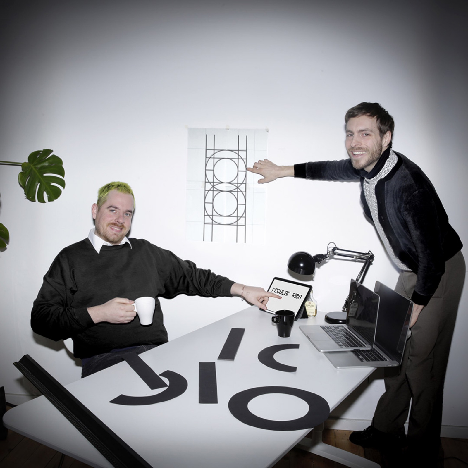
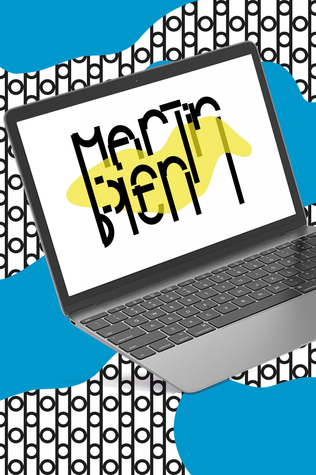
The briefing of Frankfurt am Main based creative producer and copywriter, Martin Bien, was put into one main thought: formal rigor. As Martins main medium apparently is text, it was pretty clear to us that this rigor needs to show in the typeface of his visual identity.
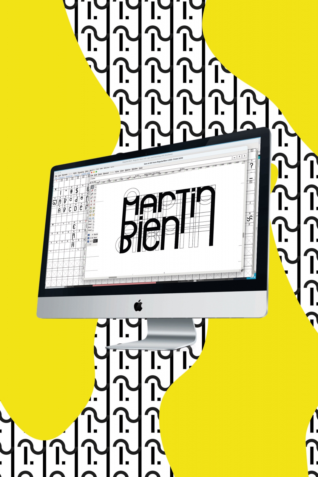
Inspired by Bauhaus aesthetics, we basically cut off any décor: We refused using serifs, we avoided ligatures and ghosted upper, middle and low case lines. Every single minuscule and majuscule of our developed typeface REGULAR BIEN is simply based on two shapes: a line and a circle. Coming from this reduction, we created joyful variations excessively playing with rather bold and black than silver linings.
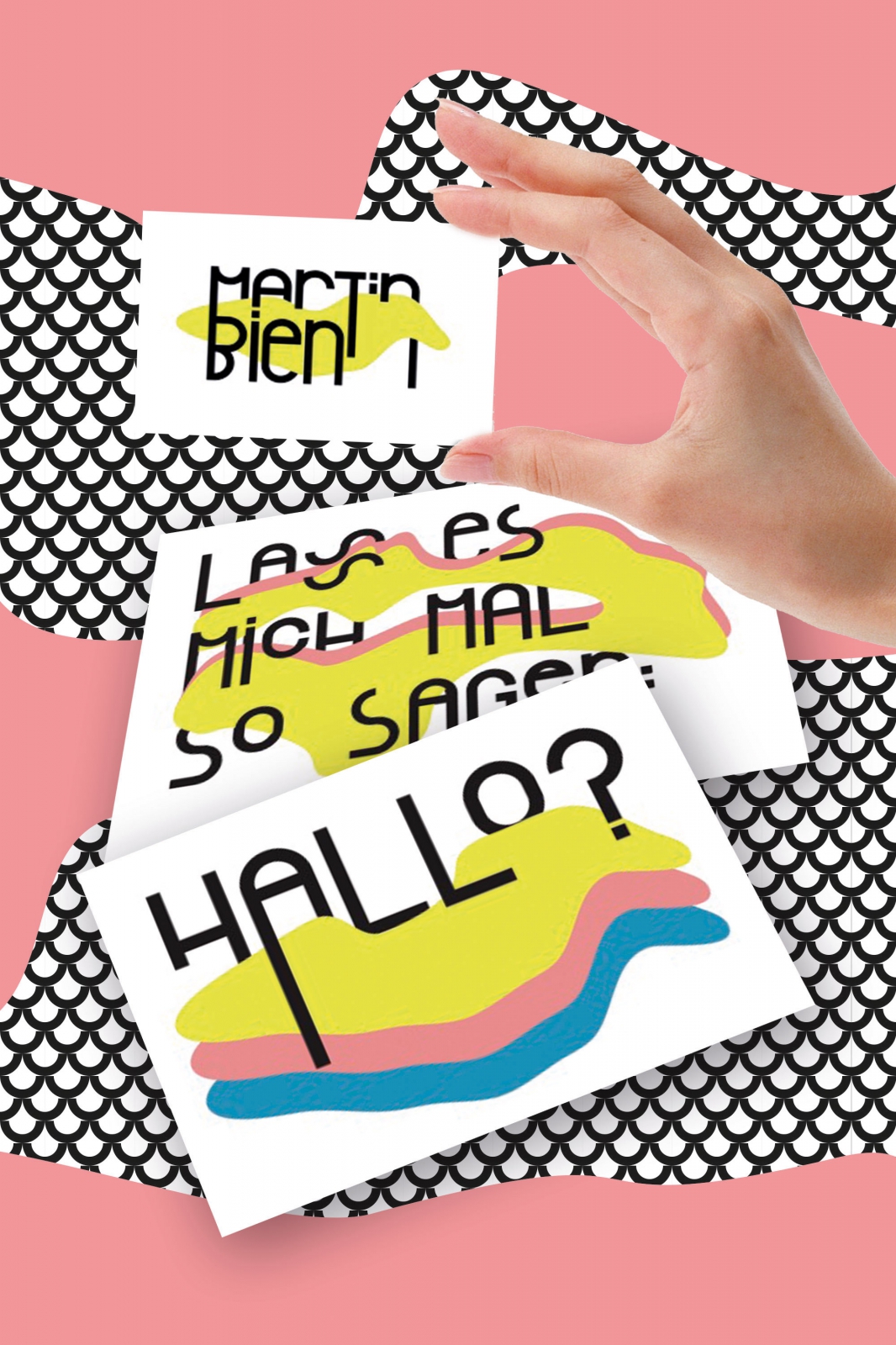
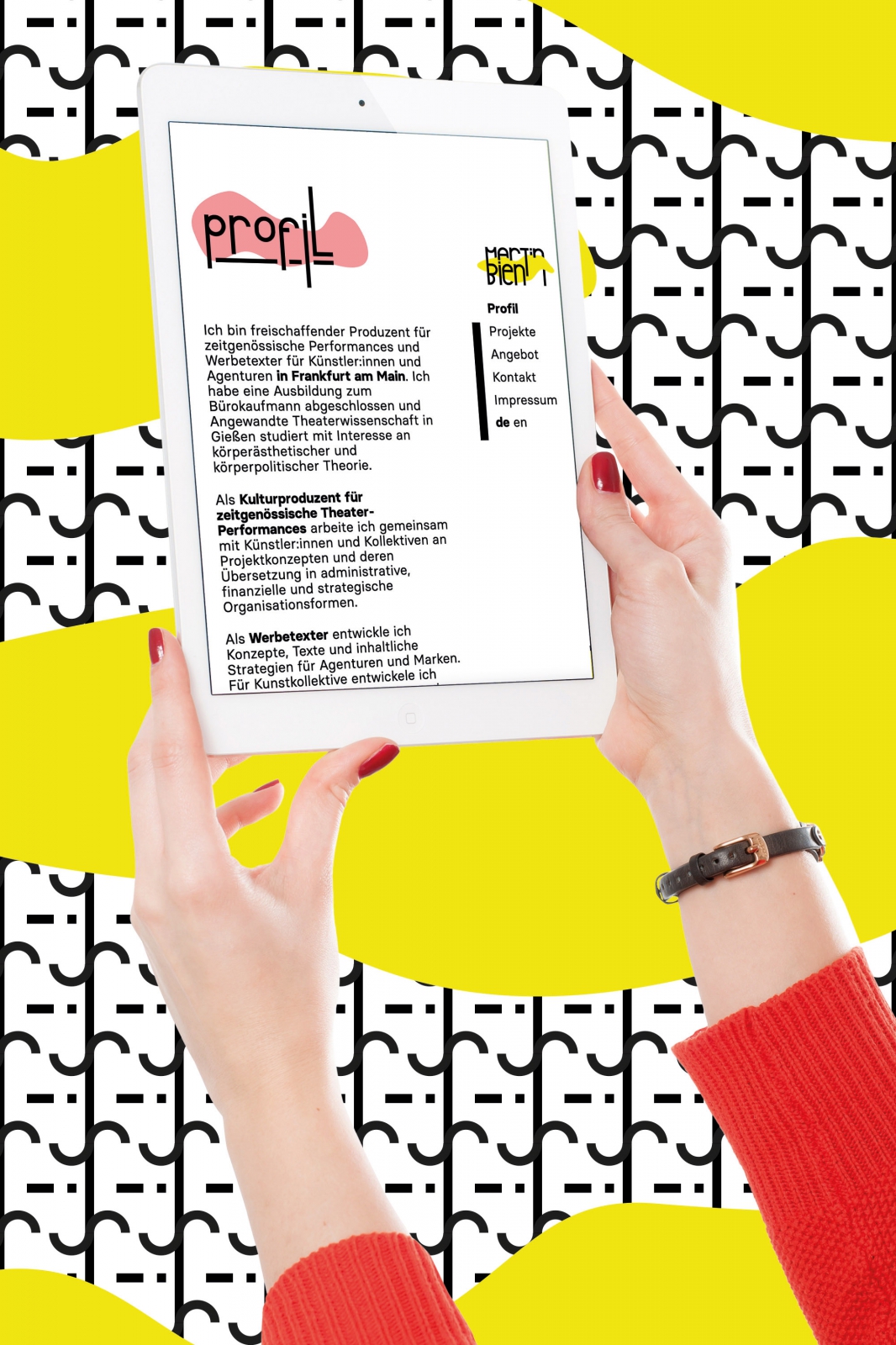
For creating the visual identity, we combined rigid formalism with a little spice of colorful arbitrariness: Along to the formal font, we put aside shapeshifting, amorphous forms, each coming in one of three main colors. Cause in the end, a little décor never hurt nobody, right?
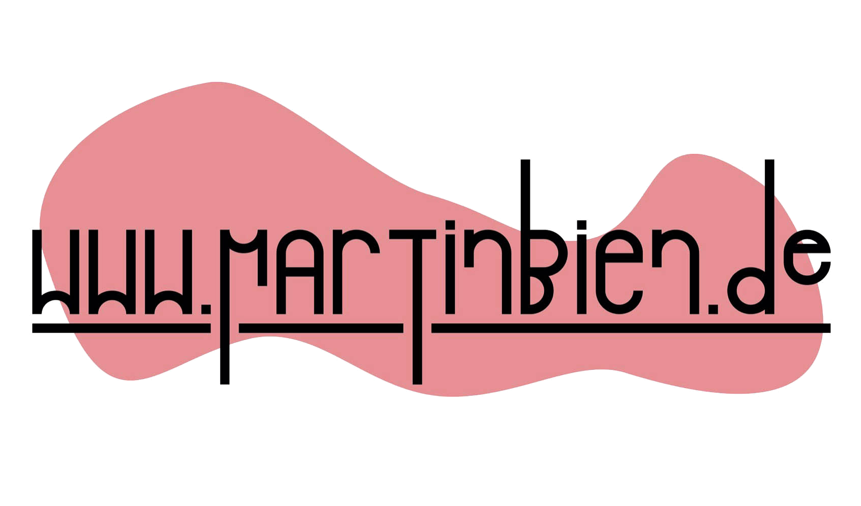
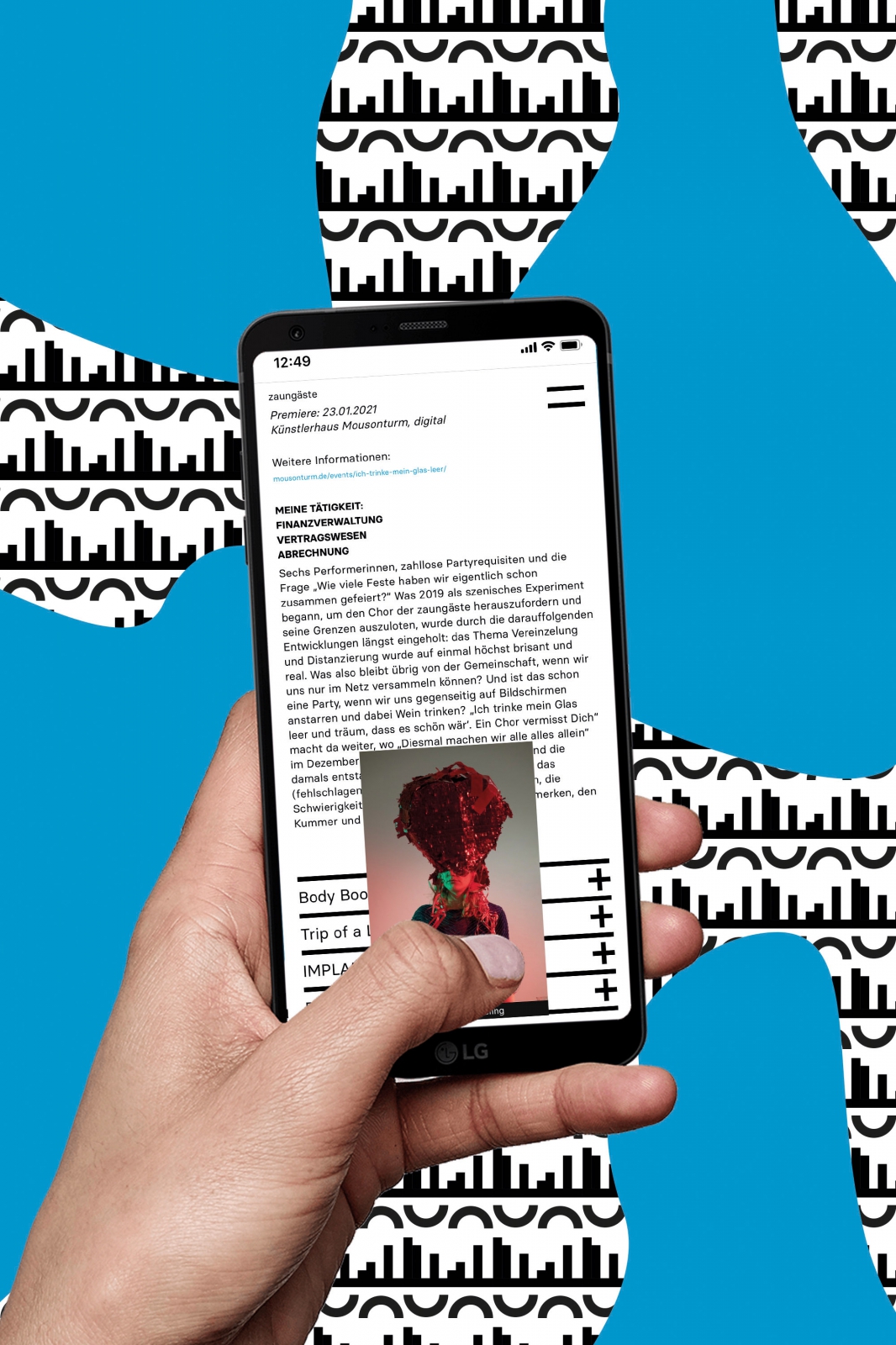
We applied the visual identity concept to the logo and basic print products. Together with the web developer, Santiago Duque, we also put this concept into the web space: www.martinbien.de.
read less